Rolex employed four different manufacturers: Singer at La Chau-de-Fonds for lacquered and galvanised classical models, Beveler in Geneva for lacquered and galvanized dials and also some short series of jewelry models; Stem in Geneva for their creations in semi-precious stones, mother of pearl and pave brilliants, Lemrich in La Chau-de-Fonds,
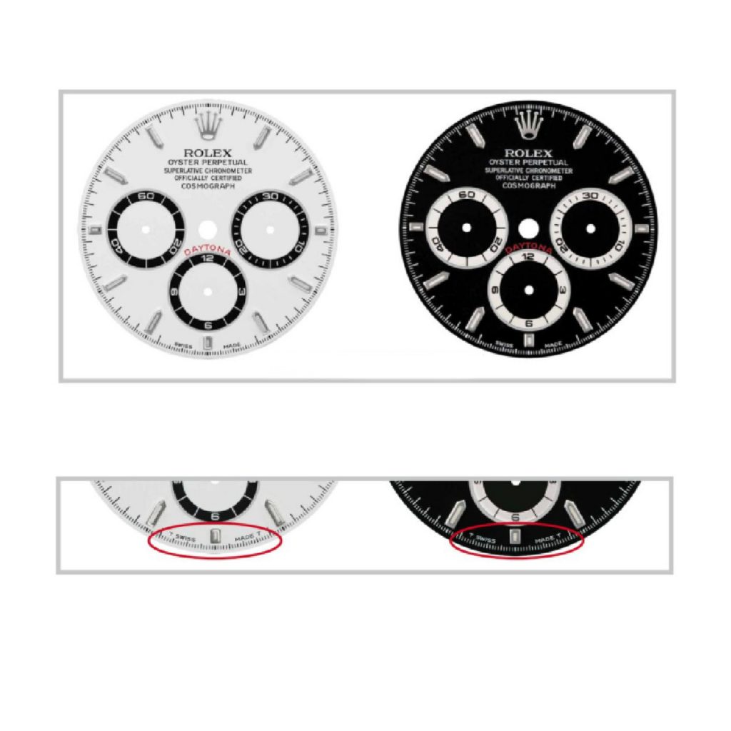
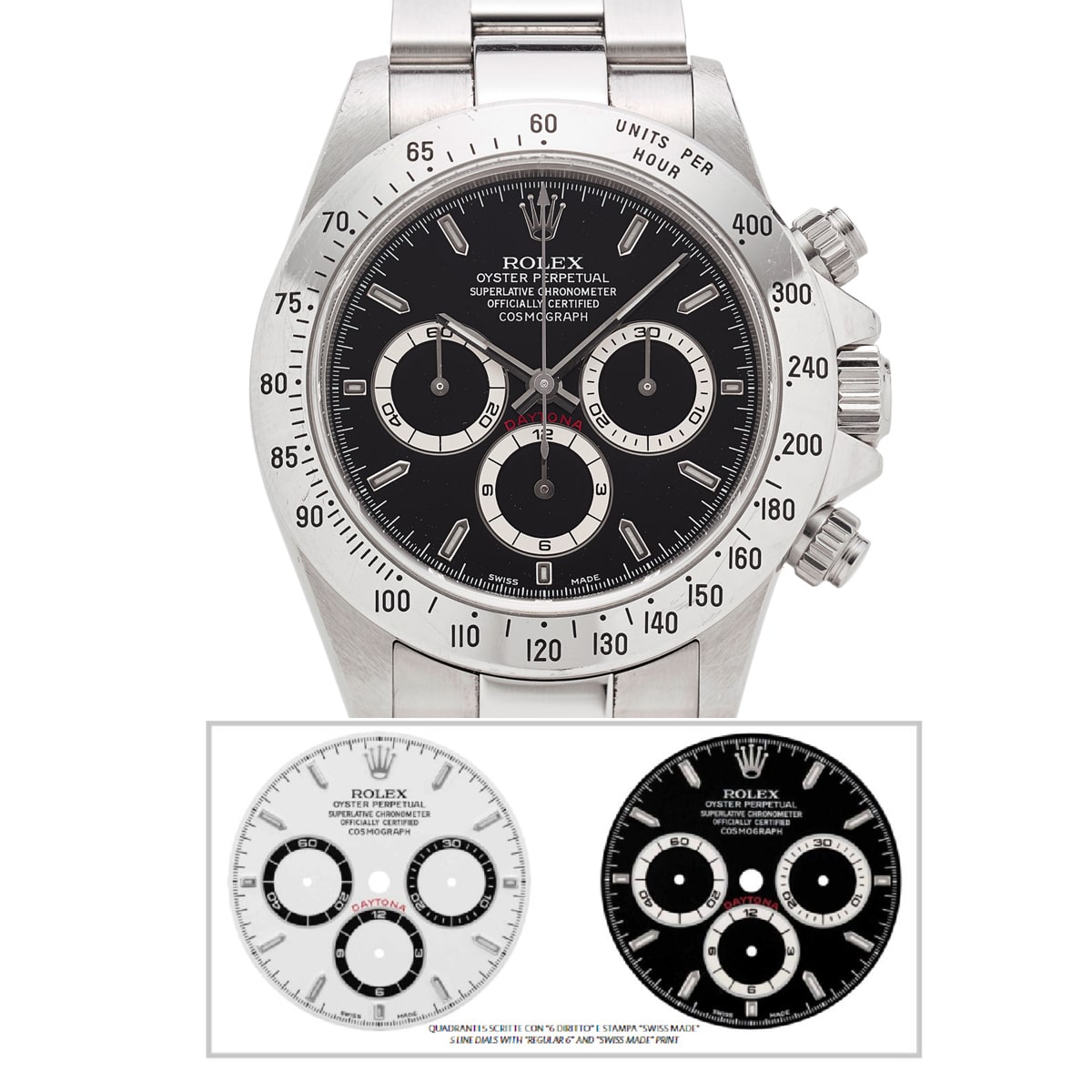
On the dials of the series 16500, the 12 is replaced by the logo and is surmounted by the inscription giving the specifics of the watch. The Rolex logo is identical for all dials even though they were produced by four different manufactures. The rings of the totalizers are available in the least two sizes, narrow or wide fonts and writing position changes.
At the end of the 1980s the process for affixing the name Rolex and the technical characteristics change. The transferring plate is no longer hand-engraved, instead an acid process is used with allows a better quality even in the slightest details.

For the Cosmograph (series 16500), Rolex offered a vast choice of colors and iconography.
The inscriptions appear in a variety of ways since Rolex always looked for ways vary their position so as to obtain a graphically perfect dial.
For the classic models, the background color of the dial could be champagne, black, white and brilliant lacquered white (incorrectly called “enamel” by collectors and produced only during three short periods from 1988 to 1989). It is worth noting that some “enamel” dials were personalized for Tiffany & Co.
With auxiliary dials edged with a ring of brilliant metal, treated with rhodium or gilded,, the graduations of the totalizers are held within the ring, sometimes brilliant and sometimes opaque grained. Generally the auxiliary dials contrast with the background color in order to increase legibility.
The word “DAYTONA” in always in red or bordeaux (and more rare gilded – see at page 213) regardless of the silkscreen variations or the positioning on the hours totalizer.
In 1988 the brand name and the inscriptions were spread over five lines with a break of one line for the name of the model. American collectors called this type of dial the “floating dial”. All the characters of the letters were in bold. The number 6 of the hours’ totalizer followed similar characteristics (viewed as 9). The distance between SWISS MADE is much closer than in later versions.
From the end of 1993 to 2000 we find (with very few changes) the dial inscriptions in five close but asymmetric. This includes the name of the model and small differences. All the letters remain in refined characters and less pronounced even though the numbers of the auxiliary dials are more evident and large. Towards the end of 1997/1998 the distance between the words “SWISS MADE” becomes identical to the preceding version.


